“Water, water, everywhere, nor any drop to drink…” is a famous line from “The Rime of the Ancient Mariner” by Samuel Taylor Coleridge. It appears when the mariner and his crew are stranded at sea, surrounded by salt water they cannot drink. It applies so well to data.
Many institutions, including the one we work for, do a great job of collecting data. Data about students’ performance in a class; data regarding how well faculty teach a class; data on where students are from; data, data, data! But then what? How do we get the data from its raw form into something tangible? How do we get faculty, course developers, and even the institution itself to act on the data collected?
Enter PAI… Portal for Academic Insight. At Embry-Riddle Aeronautical University, we have developed the ability to pull different data points and put them into an actionable format for everyone to see and use. PAI takes the raw data from: Student End of Term Survey, Faculty End of Term Survey, Registration/Enrollments of each course and section, final grades, course development changes/updates/redesigns, and places them neatly into a visual format using Tableau.
How did we get the data? Embry-Riddle Aeronautical University is great at collecting data. Every survey conducted by Institutional Research (IR) and the colleges is stored in a central location. With the help of IR, we were able to export the raw data out of the database and into an Excel format. The same goes for enrollment information. We contacted our IT department and granted access to reports that we could once again download and add to our Excel sheet. The last two elements (grades and course developments) were processes that we had access to already.
Finally, all the information was in one single Excel file. Our major hurdle was making sure the data we were collecting was the same. We wanted to match “Apples to Apples” and not have to convert data. The process from conception to institutional adoption was faster than we expected. The time to develop the tool and gather all the data only took a few weeks. Fine-tuning the data took a little longer. It was less than a year before we had Leadership looking at and using the information.
Using the power of Tableau and having the right skilled people, we were able to display the information from all the elements into one single, visible interpretation of the data. In Figure 1, you can see the different elements that we collected, assigned colors to them and asked Tableau to generate a heat map based on the set of criteria. From here, the data started to tell its story.
Figure 1:
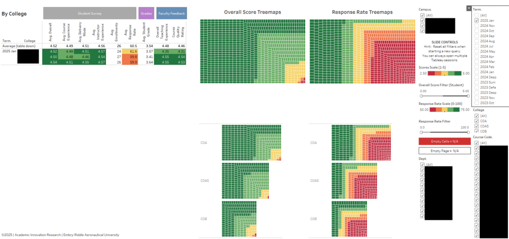
(The Heat Map shows dark green as positive and the yellow and red show negative results.)
With the longitudinal data, we were able to quickly digest the information and see patterns, anomalies, highs and lows. The power of this tool started to become noticeable after we started to present the tool and the information it was displaying to key leadership. At first, Leadership had many questions about what they were seeing, and of course, they wanted to know how we got this information. We assured them that the data was already there; we just developed a tool to make it easier to read the information.
With this new look at our data, the Chancellor, College Deans, and departments were able to make strategic decisions based on PAI. There were times when we needed to refine what was being displayed, take feedback to make improvements, and as each term passes, new data will be entered, continuing to reshape the story being told by the data.
It did not take long for the word to get out about PAI. Soon, the Provost was interested in what was assisting the ERAU Worldwide Chancellor. The Chancellor has always challenged his colleagues and faculty to be the best educators, and our students have the best experience they could have in our online environment. A version of PAI was modified for each residential campus site, tweaked to their personal needs.
In Figure 2, the information is broken down by course, moving from a 30,000-foot view in Figure 1 to a more in-depth look at each college and the courses that were offered during a specific term. This information allowed the colleges and departments to see where their classes were succeeding and where they needed to make tweaks to the course.
Figure 2:
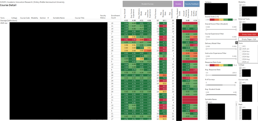
(The columns represent the different data points collected. The same color designations from Figure 1 are used here. The large blacked out area for security and privacy is the information about specific courses and faculty.)
Today, PAI is one of many data-related tools used at Embry-Riddle Aeronautical University – Worldwide campus. One of our latest tools identifies where our faculty and students are located near our many campus sites, plus what courses each student needs to graduate. We are also now running a longitudinal data study on our programs and courses offered, all from the same data collected.
We encourage everyone to go back to their institution and see what kind of data they are collecting. How is it stored, and is it accessible? We used Tableau as our tool of choice, but Microsoft Power BI might work for you. You might be sitting on a gold mine just like we were and didn’t know it.
Our opportunities are endless. It just takes the right time, a little spark of innovation, and data!
Dr. John Boekenoogen is the Executive Director of Academic Innovation Research at Embry-Riddle Aeronautical University–Worldwide. With over two decades of experience in education, Dr. Boekenoogen has established himself as a dedicated professional in the field.
Mr. Juan Carlos Flores Calderon is the Senior Data Analyst at Academic Innovation Research at Embry-Riddle Aeronautical University–Worldwide. Data expert for over 20 years in both public and private organizations.